The colour‑curated story behind the two most celebrated paint houses in the UK – and how to make their timeless hues work in your home.
Introduction – Why British Paints Have a Cult Following
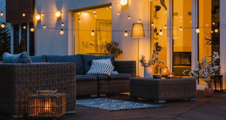
If you’ve ever walked through a historic townhouse in Bath, a sleek London loft, or a cottage on the Cotswolds, you’ve probably noticed a common thread: rich, nuanced colour, flawless finish, and a whisper of heritage. Those qualities belong to two British paint legends – Farrow & Ball and Little Greene.
Both brands have turned something as ordinary as wall paint into a design‑driven, environmentally‑conscious product. Their palettes are more than just “red” or “blue”; they’re stories, each with a name, a reference, and a personality that designers (and homeowners) love to quote.
In this guide you’ll discover:
- The histories that shaped each company
- How their colour systems differ (and overlap)
- Signature shades you must know
- Practical tips for choosing, testing, and applying their paints
- Sustainability credentials – because good colour shouldn’t cost the planet
Grab a cuppa, and let’s dive into the world of iconic British paints.
1. The Origins – From Apothecary to Design Icon
| Brand | Year Founded | Founder(s) | Original Focus | How They Became “Design‑House” |
|---|---|---|---|---|
| Farrow & Ball | 1946 | John Farrow & Richard Ball | Specialist wood‑preserving oils for the navy | 1990s: Re‑positioned as a “designer paint” after a bold re‑launch of the “Hampshire” and “Marlborough” colours, backed by celebrity endorsements |
| Little Greene | 1978 | John Little & Mike Greene | Traditional lime‑based paints for restoration work | 1990s: Embraced historic colour research, introduced “Heritage” ranges that blend old‑world pigments with modern durability |
Both brands grew out of a craft tradition – Farrow & Ball from marine wood finishes, Little Greene from lime plaster and heritage restoration. That craftsmanship still informs their formulas today: low VOC, high pigment load, and a focus on hand‑finished aesthetic.
2. Colour Philosophy – How Their Palettes Are Built
Farrow & Ball: ‘Colour as a Mood’
- Pigment‑Rich, Low‑Gloss – Each hue is loaded with up to 10 % pigment, giving depth without shine.
- Four Main Collections
- Classic Colours – Timeless shades for traditional interiors (e.g., St. James White).
- Modern Colours – Bold, contemporary tones (e.g., Strong White, Pitch Black).
- Estate Colours – Inspired by historic country houses (e.g., Oval Room Blue).
- Special Finishes – Chalky, metallic, and matte finishes for accent walls.
Key Idea: Farrow & Ball colours are named rather than numbered, encouraging emotional connection (“I’m dreaming of a Dramatic Red kitchen”).
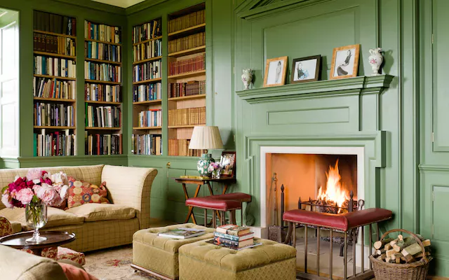
Little Greene: ‘Colour with Heritage’
- Historic Research – Every colour is traced to a period or building (e.g., Blenheim Red from the 18th‑century palace).
- Three Core Ranges
- Heritage – Traditional pigments, subtle undertones, perfect for period properties.
- Studio – Brighter, more saturated colours for modern interiors.
- Vivid – High‑impact, contemporary shades that still respect historic palettes.
Key Idea: Little Greene positions its paints as architecturally appropriate – a colour you could find on a Georgian façade, now available for your living‑room wall.
3. The Iconic Shades – “Must‑Know” Colours from Each Brand
Below is a quick cheat‑sheet for designers and DIY‑enthusiasts. All are available in both Eggshell (low sheen) and Matt Emulsion (ultra‑flat) finishes.
| Brand | Shade | Description | Ideal Use |
|---|---|---|---|
| Farrow & Ball | Hague Blue | Deep, slightly green‑tinged navy that deepens in low light. | Feature wall in a dining room; bedroom accent. |
| Farrow & Ball | St. James White | Warm, creamy white with a hint of yellow. | Whole‑home neutral base; trims and ceilings. |
| Farrow & Ball | India Yellow | Sun‑kissed, earthy gold with a muted orange undertone. | Kitchen cabinets; hallway accent. |
| Little Greene | Blenheim Red | Rich, historic scarlet reminiscent of 18th‑century wallpapers. | Library or study; fireplace surround. |
| Little Greene | Northumberland Grey | Soft, cool grey with a subtle blue cast. | Living‑room walls; modern loft backdrop. |
| Little Greene | Saffron | Warm, buttery amber with a slight olive note. | Feature wall in a modern kitchen; dining‑room ceiling. |
| Both | Matte Black / Pitch Black | Ultra‑deep black, zero sheen. | Frame doors, metal fixtures, or dramatic accent walls. |
Pro tip: Pair a Farrow & Ball ‘White’ (e.g., All White) with a Little Greene ‘Grey’ for a sophisticated contrast that feels both contemporary and timeless.
4. How to Choose the Right Paint for Your Space
Step‑by‑Step Decision Tree
- Identify the Architecture
- Georgian / Victorian? → Lean toward Little Greene Heritage.
- Mid‑century or ultra‑modern? → Farrow & Ball Modern or Little Greene Studio.
- Consider Light
- Low natural light? Choose a warm, reflective shade (e.g., Strong White).
- Abundant sunlight? Cooler greys or deep blues work beautifully.
- Define the Mood
- Calm & serene → Soft neutrals, muted blues, greys.
- Energetic & bold → Saturated reds, oranges, or navy.
- Test, Test, Test
- Paint a 5 cm×5 cm swatch on at least two walls (different orientations).
- Observe at three times of day; note how the colour shifts.
- Finish Matters
- Eggshell – Easy to clean, slight sheen; ideal for living spaces.
- Matt Emulsion – Soft, velvety; perfect for ceilings and high‑impact walls.
Colour‑Pairing Cheat Sheet
| Primary Colour | Complementary Little Greene | Complementary Farrow & Ball |
|---|---|---|
| Hague Blue | Blenheim Red (dramatic contrast) | Strong White (softens) |
| Northumberland Grey | Saffron (warm pop) | India Yellow (golden glow) |
| St. James White | Northumberland Grey (modern neutrality) | Hague Blue (classic depth) |
5. Application Tips – Getting That Signature Finish
| Tip | Why It Works | How to Do It |
|---|---|---|
| Prime with the same brand | Prevents colour bleed & improves adhesion. | Use Farrow & Ball Primer for Farrow & Ball paints; Little Greene Pre‑Sealer for their ranges. |
| Stir, don’t shake | Preserves pigment suspension, avoids bubbles. | Use a paint‑mixing paddle on low speed for 2–3 minutes. |
| Cut‑in first, then roll | Guarantees crisp edges and even coverage. | Use a 2‑mm brush for trim; a 12‑mm roller for walls. |
| Work in “wet‑on‑wet” layers | Eliminates lap lines and colour inconsistencies. | Apply the second coat before the first dries completely (about 1 hour for eggshell). |
| Ventilate but avoid drafts | Allows proper drying while preserving colour depth. | Keep windows slightly open; use a low‑speed fan for airflow. |
Pro‑secret: For a hand‑painted look, lightly sand the first dried coat with 220‑grit sandpaper before applying the second. This technique is widely used on Farrow & Ball’s chalk finishes and Little Greene’s lime paints.
6. Sustainability – Green Credentials That Matter
| Brand | Key Sustainable Features | Certifications |
|---|---|---|
| Farrow & Ball | Water‑based, ≤ 30 g/L VOC, recycled packaging, pigment sourced from responsibly managed mines. | BREEAM (Good), WRAP (Approved) |
| Little Greene | Low‑VOC (≤ 20 g/L), natural lime base in Heritage range, biodegradable containers, carbon‑offset shipping. | ISO 14001 (Environmental Management), Green Seal (Silver) |
Both companies publish annual sustainability reports, so you can trace the carbon footprint of each colour. If eco‑friendliness is a priority, the Little Greene Heritage line currently has the smallest VOC footprint, while Farrow & Ball’s Matt Emulsion wins on durability (fewer repaint cycles).
7. Where to Buy – From Showrooms to Online
| Purchase Channel | What to Expect | Tips |
|---|---|---|
| Brand Showrooms (London, Bath, Manchester) | Full colour libraries, expert advice, on‑site sample printing. | Bring a colour swatch from home to compare under the same lighting. |
| Authorized Retailers (John Lewis, B&Q, Lowe’s UK) | Wider geographic reach, occasional sales. | Verify the batch code on the can – colour consistency can vary slightly between batches. |
| Online (Official Websites, Made.com, The Paint Hub) | Home delivery, virtual visualisers, free sample packs (usually 50 ml). | Order three colour samples before committing; most sites offer a 30‑day return on unopened cans. |
| Independent Decorators | Professional application, often bundle with other finishes. | Ask for a paint‑spec sheet that includes VOC levels and drying times. |
8. Real‑World Inspiration – 3 Quick Case Studies
1️⃣ Georgian Townhouse – Little Greene Heritage + Original Plaster
- Palette: Blenheim Red on the main staircase, Northumberland Grey on the drawing‑room walls, St. James White on ceilings.
- Result: The historic red draws the eye upward, while the soft grey creates a contemporary calm. The lime‑based paint allows the original plaster to “breathe”, preserving the building’s integrity.
2️⃣ Minimalist London Loft – Farrow & Ball Modern
- Palette: Pitch Black accent wall behind the sofa, All White on surrounding walls, India Yellow on a narrow kitchen stripe.
- Result: The stark black adds drama inside the open‑plan space; the bright yellow injects warmth without overwhelming the minimalist vibe.
3️⃣ Cotswold Cottage – Mixed Heritage
- Palette: Hague Blue on the kitchen island (Farrow & Ball), Saffron on the dining‑room ceiling (Little Greene), Strong White throughout.
- Result: A harmonious blend of both brands, showing that the right tones can coexist beautifully when their undertones complement each other.
9. Frequently Asked Questions
| Q | A |
|---|---|
| Do the colours look the same in a paint can as on the wall? | Not always. Light, texture, and surrounding colours shift perception. Always test on a wall before buying full‑size cans. |
| Can I mix Farrow & Ball and Little Greene paints? | Technically possible, but the differing binder systems can affect drying time and finish. For best results, stick to one brand per room. |
| How many coats are usually needed? | One high‑quality coat often suffices for light colours; darker hues typically need two coats for even coverage. |
| Are the paints suitable for exterior use? | Both brands have exterior ranges (Farrow & Ball Exterior Masonry; Little Greene Exterior Lime). Do not use interior paints outdoors. |
| What’s the best way to store leftover paint? | Seal the can tightly, store upright in a cool, dry place, and label with the colour name and date. Most paints stay usable for 5‑7 years if stored properly. |
10. Final Thoughts – Choosing Colour is Choosing Personality
Whether you’re refreshing a period property or creating a sleek contemporary oasis, Farrow & Ball and Little Greene offer more than just pigment—they deliver narrative. Their colours are curated to evoke feeling, respect heritage, and stand the test of time.
“A room should feel like a well‑written story; the colour is the voice.”
— Anonymous interior designer, fan of both brands
Take the time to sample, observe, and listen to what each hue whispers in your own space. When you finally select that perfect shade—be it Hague Blue or Blenheim Red—you’ll know it’s not just paint on a wall; it’s a piece of British design history you’re bringing home.
Ready to Paint?
- Download our free colour‑testing checklist (PDF) – a one‑page guide to swatching like a pro.
- Subscribe for monthly updates on new releases from Farrow & Ball and Little Greene.
- Share your project on Instagram with #BritishPaintsGuide – we’ll feature our favourite transformations!
Happy colouring! 🎨✨