Creating a gallery wall is one of the most personal ways to transform a house into a home. It’s not just about decor; it’s about storytelling. Combining the warmth of family portraits with the sophisticated, timeless appeal of engravings creates a visual narrative that is both intimate and curated.
Here is a guide on how to design a balanced, professional-looking gallery wall that honors your memories and your style.
1. Define Your Aesthetic: Cohesion vs. Eclecticism
Before hammering the first nail, decide on the “vibe” of your wall.
- The Uniform Look: Use matching frames (e.g., all thin black metal or all ornate gold) for both portraits and engravings. This works beautifully if you want the wall to feel like a single, organized unit.
- The Collected Look: Mix frame styles, textures, and eras. A sleek modern frame for a family photo paired with a vintage wooden frame for a 19th-century botanical engraving creates a rich, “evolved over time” feel.
2. The Art of Mixing Media
Mixing photography with engravings can be tricky because they have different visual weights. Follow these tips for a harmonious blend:
- Bridge the Gap with Color: If your family photos are vibrant and your engravings are monochrome, try converting the photos to black-and-white. This creates an instant sophisticated link between the two mediums.
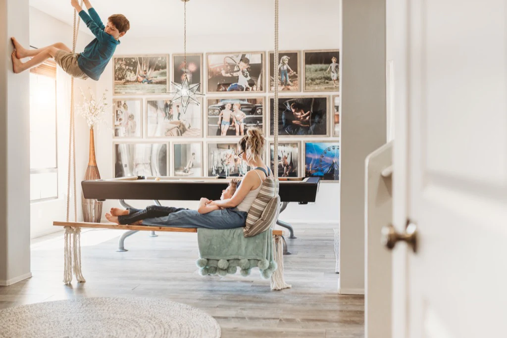
- The Anchor Piece: Choose one large item—perhaps a wide-shot family portrait or a detailed architectural engraving—to be your focal point. Place it slightly off-center and build around it.
- Vary the Scale: Don’t use only small frames. Intersperse large-scale engravings with smaller “candids” of the family to keep the eye moving.
3. Planning the Layout (The “Floor First” Method)
The biggest mistake people make is “eyeballing” the placement directly on the wall. Instead:
- Measure your wall space and mark the same dimensions on the floor using painter’s tape.
- Arrange your items within that box on the floor.
- Aim for 2–3 inches (5–8 cm) of space between each frame. Consistency in spacing is what makes a gallery wall look professional rather than cluttered.
- Trace and Template: Once you love the layout, trace each frame onto kraft paper, cut it out, and tape the paper templates to the wall. This allows you to see the scale without committing to holes.
4. Lighting and Placement
Where you hang your gallery matters as much as what is in it.
- Eye Level is Key: The center of the entire gallery (not the top frame) should sit at roughly 57 to 60 inches from the floor.
- Avoid Direct Sunlight: Engravings and old photographs are sensitive to UV rays. If the wall gets hit by the sun, consider using UV-protective glass to prevent fading.
- Add Dimension: Don’t be afraid to add a “non-flat” object, like a small wall sconce or a vintage key, to break up the frames.
Comparison: Symmetrical vs. Organic Layouts
| Feature | Symmetrical (Grid) | Organic (Salon Style) |
| Best For | Identical frame sizes | Mixed media and varied sizes |
| Atmosphere | Formal, orderly, modern | Cozy, storytelling, artistic |
| Difficulty | High (requires precision) | Medium (forgiving of errors) |
Pro Tip: When mixing family photos with art, try to match the “mood.” If you have a moody, dark-toned landscape engraving, place it near a family portrait taken in soft evening light or a forest setting.
A gallery wall is a living project. As your family grows or you find a new engraving at an antique market, you can expand the edges, allowing the “story” on your wall to evolve alongside your life.