The year 2025 is poised to be a pivotal year in the world of interior design, and at the heart of this transformation lies the power of paint. While furniture and decor add character, it’s the walls that set the stage, creating the mood and atmosphere of a room. This article dives deep into the predicted interior paint trends for 2025, offering a comprehensive guide to the colors, finishes, and techniques that will dominate the design landscape. From the psychology behind the trending palettes to practical advice on how to incorporate them into your home, we’ll equip you with the knowledge to transform your space with confidence.
The Psychology of Color in 2025
The color trends for 2025 are not arbitrary; they are a direct reflection of our collective desires and societal shifts. Following a period of global uncertainty, there’s a strong push towards colors that promote a sense of calm, security, and connection to nature. We are seeking authenticity, comfort, and spaces that act as sanctuaries from the digital world. This translates into a palette that is both grounding and uplifting, with a focus on natural, earthy tones and a subtle injection of invigorating, yet not overwhelming, hues.
Key psychological drivers for 2025 paint trends include:
- Mindfulness and Wellness: Colors that encourage a sense of tranquility and focus, promoting mental well-being.
- Sustainability and Nature: A strong connection to the natural world, with a preference for organic, eco-friendly palettes.
- Personal Expression and Authenticity: A move away from stark, minimalist trends towards spaces that reflect individual personalities and tell a story.
- Comfort and Sanctuary: Creating a cocoon-like environment where one can relax and recharge.
2025’s Defining Color Palettes
Based on these psychological drivers, several distinct color palettes are emerging as the frontrunners for 2025. These are not just individual colors but entire families of hues that work together to create a cohesive aesthetic.
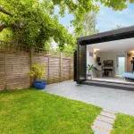
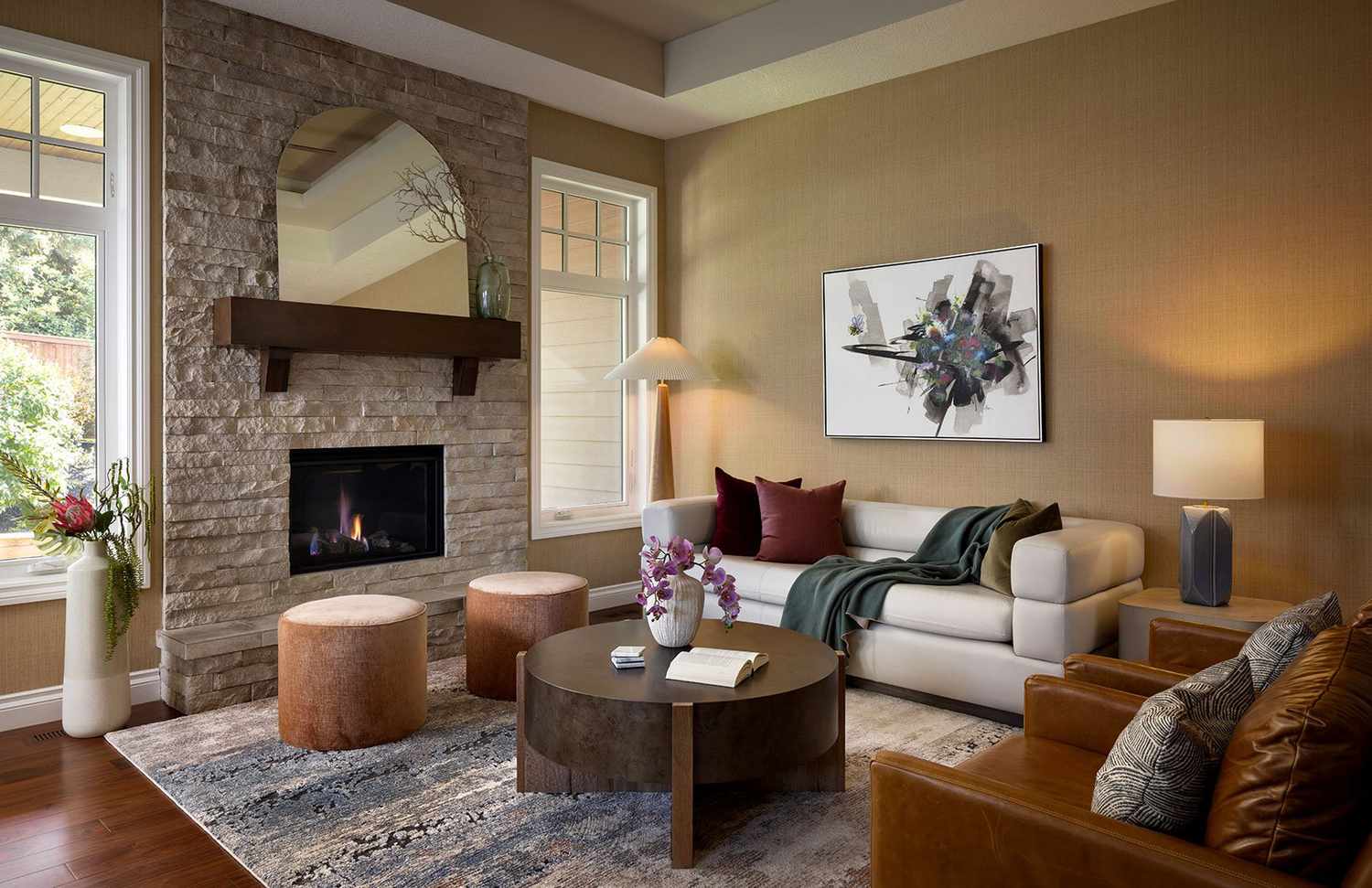
1. The Earthen Sanctuary: Grounding Greens and Warm Neutrals
This palette is a direct response to our desire for a deeper connection with nature. It’s an evolution of the popular biophilic design movement, moving beyond just adding plants to truly immersing a space in nature-inspired colors.
- Primary Colors: Sage Green, Moss Green, Olive Green. These shades are incredibly versatile, offering a calming backdrop in living rooms, bedrooms, and even kitchens. They pair beautifully with natural wood tones and organic textures like linen and jute.
- Complementary Neutrals: Clay, Terracotta, Sandstone. These warm, earthy neutrals add a sun-baked, Mediterranean feel. They are perfect for creating an accent wall or for use in a smaller space to make it feel cozier.
- Accents: Deep Teal, Burnt Orange. A touch of a deeper, more saturated color can be used to add drama and visual interest without overwhelming the serene palette.
How to Use It: For a living room, consider painting the main walls in a soft sage green and using a terracotta-colored accent chair or a few throw pillows to introduce warmth. In a bedroom, a moss green can create a tranquil, restful atmosphere, especially when paired with light wood furniture and linen bedding.
2. The Golden Hour: Soft Yellows and Sunny Hues
This palette is all about optimism, warmth, and the feeling of a permanent “golden hour” inside your home. It’s a subtle and sophisticated take on yellow, moving away from bright, primary yellows towards softer, more nuanced tones.
- Primary Colors: Buttery Yellow, Muted Mustard, Pale Lemon. These shades are surprisingly versatile and can be used to brighten up a dark hallway or create a cheerful atmosphere in a kitchen. They work well in spaces with a lot of natural light, where they can truly shine.
- Complementary Neutrals: Cream, Off-White, Greige (a blend of gray and beige). These neutrals prevent the yellow from becoming too overpowering, providing a soft and elegant backdrop.
- Accents: Soft Lavender, Dusty Rose. A hint of a cool-toned accent can provide a beautiful contrast to the warm yellows, creating a balanced and sophisticated look.
How to Use It: Consider a buttery yellow in a dining room to create an inviting and sociable space. In a home office, a muted mustard can be both energizing and grounding. This palette pairs well with minimalist decor and clean lines, allowing the color to be the star of the show.
3. The Digital Detox: Deep Blues and Rich Purples
This trend is about creating a space that feels like a refuge from the constant stimulation of the digital world. It’s a return to classic, timeless elegance, using deep, saturated colors to create a sense of drama and sophistication.
- Primary Colors: Midnight Blue, Royal Blue, Eggplant Purple. These deep hues are ideal for creating a cozy, intimate atmosphere. They are particularly effective in bedrooms, dining rooms, and home theaters.
- Complementary Neutrals: Charcoal Gray, Warm Black, Slate. Dark neutrals enhance the richness of the primary colors, creating a moody and sophisticated feel.
- Accents: Emerald Green, Gold. A touch of metallic gold or a jewel-toned green can add a pop of luxury and a hint of glamour to this dramatic palette.
How to Use It: A bedroom painted in a deep midnight blue can feel incredibly luxurious and calming, especially when paired with plush velvet textures and soft lighting. In a living room, a deep eggplant purple accent wall can serve as a stunning focal point, especially when framed by a charcoal gray trim.
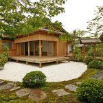
4. The Mindful Minimalist: Soft Whites and Natural Textures
While the stark, clinical minimalist look is fading, a new form of minimalism is emerging. This trend is about using a limited color palette to highlight textures, natural light, and the simple beauty of a space.
- Primary Colors: Off-White, Ivory, Chalk White. The key here is to choose whites with warm undertones to avoid a sterile feel. These colors make a space feel open, airy, and clean.
- Complementary Textures: The real star of this trend isn’t the color, but the texture. Think Limewash paint, which provides a soft, chalky finish with a subtle depth. Other textures include plaster, clay, and Venetian stucco.
- Accents: Light Wood, Rattan, Woven Materials. These natural elements provide warmth and visual interest to an otherwise monochrome palette.
How to Use It: This palette is perfect for those who want a serene, Scandinavian-inspired aesthetic. Limewash paint on all walls in a living room can create a beautiful, textured canvas. Pair it with light oak furniture, a cozy boucle armchair, and a few carefully chosen ceramic vases to create a space that is both minimal and full of character.
Beyond Color: Finishes and Techniques for 2025
The color you choose is only half the story. The finish and technique you use to apply the paint are equally important in creating the desired effect.
1. The Rise of Matte Finishes
Matte paint has been gaining popularity for several years, but in 2025, it will be the undisputed champion. Matte finishes absorb light, which helps to conceal imperfections in the wall surface. This finish provides a soft, velvety look that is incredibly sophisticated and modern. It’s perfect for creating a warm, non-reflective atmosphere, especially with the deeper and richer colors of 2025.
2. Textured Finishes: More than Just Paint
As we saw in the “Mindful Minimalist” palette, texture is a huge trend for 2025. Limewash and other mineral-based paints are becoming more accessible and are being used to create walls with a beautiful, mottled, and tactile appearance. These finishes add depth and character that a flat, single-color wall cannot.
3. Statement Ceilings
For years, the ceiling has been an afterthought, almost always painted a standard white. In 2025, this is changing. The ceiling is becoming the “fifth wall,” an opportunity to make a design statement. Consider painting the ceiling in a rich, saturated color from your palette, or even using a metallic or high-gloss finish to create a surprising and luxurious effect.
4. Color Blocking and Painted Arches
Color blocking is not new, but it is being reinvented for 2025. Instead of bold, geometric shapes, the trend is towards softer, more organic forms. Painted arches and free-form shapes are being used to define zones within an open-plan space or to highlight a piece of furniture. This technique adds a playful and artistic touch to a room.
How to Choose the Right Paint for Your Home
Selecting the perfect paint is a process that goes beyond simply picking a color from a swatch. Here’s a step-by-step guide to help you make the best choice:
- Consider the Light: The amount of natural and artificial light in a room will drastically change how a color appears. A color that looks beautiful in a well-lit showroom might look completely different in a dark hallway. Always test paint samples on your walls.
- Test, Test, Test: Never commit to a color without buying a small sample can and painting a large patch on your wall. Look at it at different times of the day and in different lighting conditions.
- Think About the Mood: What do you want to feel when you are in this room? Calm and relaxed? Energetic and creative? The color you choose should align with the function and intended mood of the space.
- Harmonize with Existing Elements: Take into account your existing furniture, flooring, and other permanent fixtures. The paint color should complement these elements, not clash with them.
- Don’t Be Afraid to Hire a Pro: A professional designer or painter can offer invaluable advice on color palettes, finishes, and techniques, ensuring a perfect result.
Your Home, Your Sanctuary
The paint trends for 2025 are a testament to our evolving relationship with our homes. We are moving away from purely aesthetic concerns towards creating spaces that truly nurture our well-being and reflect our individual stories. Whether you are drawn to the tranquil greens of the Earthen Sanctuary, the cheerful yellows of the Golden Hour, or the dramatic blues of the Digital Detox, there is a trend for every personality. By embracing these palettes, finishes, and techniques, you can transform your space from a simple dwelling into a personal sanctuary, a place where you can truly live, relax, and thrive. So grab a brush and start your journey to a more colorful and meaningful home in 2025.