
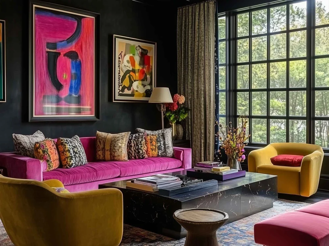
Have you ever walked into a room and instantly felt a wave of calm, or conversely, felt strangely anxious for no apparent reason? While furniture, lighting, and clutter play a part, the invisible orchestrator of your emotions indoors is often staring right back at you from the walls.
Colour is more than just a visual aesthetic; it is a biological and psychological trigger. Interior designers and psychologists have known for decades that the hues we surround ourselves with can profoundly impact our mood, productivity, heart rate, and even our sleep patterns.
If you are planning a home makeover, understanding the psychology of colour is the secret to creating spaces that don’t just look good, but feel good. Let’s dive into how different wall paint colours influence your mind and emotions, room by room.
The Science of Colour Psychology
Colour psychology is the study of how hues affect human behaviour and mood. When light hits your retina, it sends signals to the hypothalamus—the part of the brain that governs your hormones and endocrine system. This triggers physiological responses. For instance, warm colours like red can subtly raise your heart rate and stimulate appetite, while cool colours like blue trigger the release of calming neurotransmitters.
Choosing the right wall paint isn’t just about matching your sofa; it’s about curating the emotional backdrop of your daily life.
Blues: The Antidote to Anxiety
- Best for: Bedrooms, bathrooms, and home offices.
- The Mood: Calm, serene, focused, and trustworthy.
Blue is universally loved, and for good reason. Lighter shades of blue mimic the sky and sea, signalling to the brain that it is time to lower blood pressure and slow respiration. It is the ultimate colour for relaxation.
- How to use it: Soft, powder blues work wonders in bedrooms to promote deep sleep. Meanwhile, crisp navy blues in a home office can anchor the room, fostering deep focus and reducing mental fatigue.
Greens: Renewal and Balance
- Best for: Living rooms, kitchens, and home offices.
- The Mood: Refreshing, balanced, restful, and grounding.
As the dominant colour of the natural world, green represents growth, renewal, and safety. Because the human eye requires the least amount of adjustment to see green, it is profoundly soothing to the visual cortex.
- How to use it: Sage or olive greens bring the restorative power of nature indoors, making them fantastic for living spaces. Brighter, minty greens can energize a kitchen, helping you feel refreshed during your morning routine.
Yellows: Sunshine and Stimulation
- Best for: Kitchens, dining rooms, and creative studios.
- The Mood: Optimistic, energetic, warm, and uplifting.
Yellow is the colour of sunshine, instantly evoking feelings of happiness and vitality. It stimulates the nervous system and encourages communication, making it a great social catalyst.
- How to use it: Tread carefully with bright, saturated yellows—in large doses, they can actually induce anxiety or cause eye strain in babies and adults alike. Instead, opt for buttery, pastel, or mustard yellows to introduce warmth and cheer without overwhelming the space.
Reds: Passion, Power, and Appetite
- Best for: Dining rooms, entryways, or accent walls.
- The Mood: Exciting, dramatic, passionate, and stimulating.
Red is the most intense colour on the spectrum. It raises the pulse, increases adrenaline, and stimulates the appetite. It’s bold, unapologetic, and commands attention.
- How to use it: While red might seem like a bold choice for a bedroom, it can feel cozy and romantic in low evening light. However, it is most successfully used in dining rooms (where it encourages lively conversation and appetite) or as a dramatic accent wall in an entryway to make a striking first impression.
Neutrals (Whites, Greys, and Beiges): The Blank Canvas
- Best for: Hallways, open-concept living areas, and minimalist spaces.
- The Mood: Clean, spacious, flexible, and peaceful.
Neutrals are the wardrobe basics of interior design. White represents purity and space, grey offers modern sophistication, and beige (or “greige”) brings earthy warmth.
- How to use it: Pure, stark white can make a small room feel massive and airy, but if overused, it can feel sterile or clinical. To prevent neutral rooms from feeling cold, layer textures—like woven rugs, wooden furniture, and linen curtains—to add warmth and emotional depth.
Matching Colour to Function: Room-by-Room Guide
When picking up a paint swatch, always ask yourself: What is the primary activity that happens in this room?
- The Bedroom: Stick to cool, muted tones like soft blues, dusty lavenders, or warm greys to wind down the nervous system at the end of the day.
- The Home Office: Choose sage green, navy, or crisp off-white to minimize distractions and boost cognitive function.
- The Kitchen: Energize the heart of your home with warm whites, buttery yellows, or earthy terracotta tones that invite gathering and cooking.
Transform Your Space, Transform Your Mind
Your home should be your sanctuary—a physical reflection of the energy you want to invite into your life. Before you commit to your next painting project, don’t just think about what looks trendy on Instagram. Ask yourself: How do I want to feel when I walk into this room?
Paint is one of the most affordable and transformative tools in interior design. By harnessing the psychology of colour, you can turn your walls into a powerful prescription for emotional well-being.